Showing posts with label Music Video. Show all posts

Tuesday, 28 January 2014

Digipak: Initial Ideas Take Three

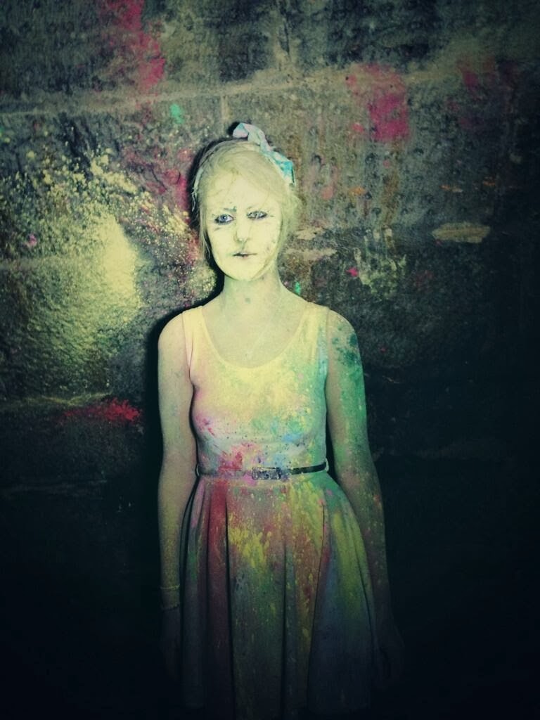
The general idea to this album cover is to have a girls face with powder paint splatted over all her on the front cover, filling up the space with bold and sharp text stating the album's title, 'Love Me Again'. 


The powder paint highlights the youthful, carefree vibe the album has, and links the the dynamic, upbeat songs which feature.

The typography we are planning to use is extremely bold and 'blocky' which connotes to the bold bassline within the song. The fact it is sharp and angular also relates to the choppy beats within the song too. 

Love Me Again is a Dance/Pop song. The conventions of this genre is loud, bold, colourful, up beat and powerful elements. We have showed this in our album cover idea through the typography and the iconography with the bold and colourful text and picture.

John Newman has a traditional look to himself. He is very old school and retro. On his album covers you see dull colours and the main focus is him on the front. We have added the UKF (who remixed the song) look to our album cover and made it very colourful and bold to make it stand out as a dance/pop album. 

Sunday, 26 January 2014

Digipak: Initial Ideas Take Two


For this album cover idea we designed a symbol for the song. We picked a heart for the 'Love' aspect of the lyrics and we put an arrow on the end of the heart to show the 'Again' part of the lyrics. Together, this symbol represents loving someone again, almost like recycled love.

We decided that the Outside of the heart would have splattered powder paint on a black background with the heart outlined in black. With the bright colours of the powder paint and the boldness of the black heart, this shows that the sound is going to be loud, sharp and to the point; It portrays the dance/pop genre within the album cover.

The typography we are planning to use is extremely bold and 'blocky' which connotes to the bold bassline within the song. The fact it is sharp and angular also relates to the choppy beats within the song too. 

Love Me Again is a Dance/Pop song. The conventions of this genre is loud, bold, colourful, up beat and powerful elements. We have showed this in our album cover idea through the typography and the iconography with the bold and colourful text and picture.

John Newman has a traditional look to himself. He is very old school and retro. On his album covers you see dull colours and the main focus is him on the front. We have added the UKF (who remixed the song) look to our album cover and made it colourful and bold to make it stand out as a dance/pop album. 

Thursday, 23 January 2014

Digipak: Initial Ideas Take One


Our first idea was to have a completely black background with one hand print - that had been covered in bright powder paint and then stamped on - in the center of the frame.


We thought that this would continue the theme of contrasts which we portrayed in our music video, as the colourful hand would stand out against the dark background. The symolism of hand also represents holding hands in a relationship as well as the action of throwing the powder paint. The fact there is just one hand represents power and individuality. 

The typography we are planning to use is extremely bold and 'blocky' which connotes to the bold bassline within the song. The fact it is sharp and angular also relates to the choppy beats within the song too. 

Love Me Again is a Dance/Pop song. The conventions of this genre is loud, bold, colourful, up beat and powerful elements. We have showed this in our album cover idea through the typography and the iconography with the bold and colourful text and picture.

John Newman has a traditional look to himself. He is very old school and retro. On his album covers you see dull colours and the main focus is him on the front. We have added the UKF (who remixed the song) look to our album cover and made it very colourful and bold to make it stand out as a dance/pop album. 

Friday, 20 December 2013

Final Video

Here is the final cut of our music video for Love Me Again.      

Editing Update: Export Disaster!

We were at the stage where we were ready to export our film out of Final Cut Pro and all was going well until our trusty Mac, Sean, had a complete meltdown!

This was a complete disaster as the whole of our music video, including ALL original shoots and footage was on this particular mac's hard drive. We were really worried that we were going to lose all of our work and would have to start from scratch. It was an extremely tense time but we were hoping for the best.

Luckily, our IT Technician managed to work his magic and save the file, however it was not exported in the best quality it could have been, but frankly we were happy to have it at all!

We have now uploaded our video up onto YouTube and are able to breathe a big sigh of relief.

Tuesday, 12 November 2013

Studio Shoot: Research

GENERAL LOGISTICS
We have decided to shoot the second part of our music video in a stylistic medium, whiich we will do in a photography studio. The one we have found is very local and offers a discount to students - which is always very helpful on the finance front!

LOCATION
We are shooting our video in a local studo used for all kinds of photography projects. They offer a white, black or grey backdrop so it is fabulous to have a choice - however we are going to use black as it will maintain our contrast of white/black/colour theme.

We are going to set up a stereotypical but simplistic dining table setup, so will need to bring plates, cutlery and a tablecloth etc and we have been informed that there is a table available at the studio which we can use; this definitely helps logistically as we do not want to have to hunt around for a table! 

COSTUME
Costume-wise, we want to stick quite closely to the theme of black and white/representation. Therefore the girl will wear black leggings and a plain white top, whilst the male actor will wear jeans and a T-shirt. This will mean that it won't take away from the concept we are trying to focus on, which is a fight for love between a couple.

ACTORS
To help keep the storyline consistent and easy for the audience to follow, we used one of the same couples we had used from the powder paint shoot. 

HAIR/MAKE UP
Again, we wanted to keep this stylistic and simple, so are having the girl's hair in a typical half up/half down style and the male's hair normal. 

PROPS
We will need a table and chairs which is being supplied by the studio. We are bringing the extras, including the plates and cutlery as well as the mobile phone and magazines. There is nothing too extravagant so it should be quite a straightforward setup.

LIGHTING
We are using the lighting provided by the studio, which has 2 brilliant bright white spotlights which will give our shots great depth. This is key as the background is dark, so it is essential that the actors and props are well lit in order to avoid shadows and out of focus shots. 

The lighting and colour is also very important in this scene because we have to get it to mirror that of the colours and tones within the last shoot so as to provide consistency.  This means we will have to experiment with the lighting levels quite a bit in the studio to make it the same brightness. If we don't get this spot on during the shoot, then we will have to try and sort it out in post production by altering the colour and brightness filters. 

Saturday, 2 November 2013

Editing Investigation: You're Nobody Till' Somebody Loves You - James Arthur

I decided to observe James Arthur's new song, "You're Nobody Until Somebody Loves You". I counted the cuts in this, which came to 182.

There is a large proportion of the music video which involves shrinking cinematic time, for example, the party/performance starts earlier in the day which is visible through the natural lighting and also by usual everyday happenings, however this fades into nightime where everything is a little looser and 'wild'. In realtime, this would probably take at least 6 hours, however in the music video it took 3 minutes!

There are also points in the movie where cinematic time has been expanded, for example when he first enters the music video towards the stage, alongside some shots of the people dancing at night.

The cuts generally occur when we have taken in enough information to build a picture/understanding of the culture. For example, there are several quick close ups of individuals who contribute to the urban community which are embedded within the video. The cuts are very snappy and allow us to take in the concept without becoming bored. Once we have taken this in, the editor has made it so it cuts to a different representation.

I compared this to the amount of cuts in the first 3 minutes of the film, "stick it" which resulted in 44 cuts.

This shows that music videos often operate at a far faster pace than films, and more cuts are needed. This is something we need to refine and establish to move away from the conventions of film which we studied for AS and more towards that of music videos.

Thursday, 31 October 2013

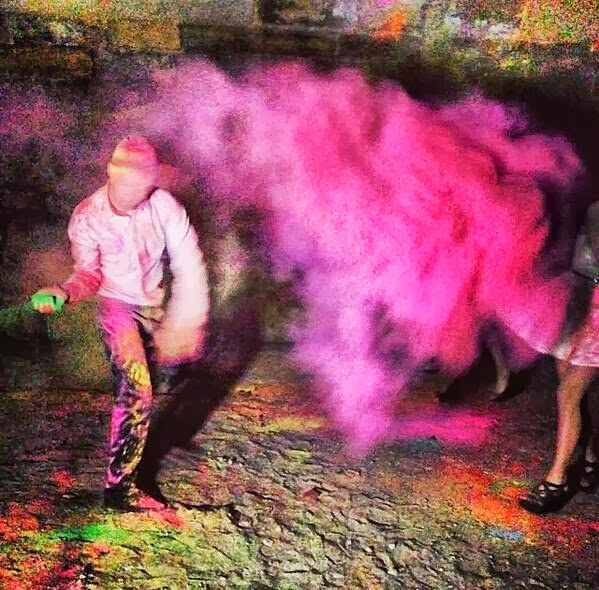
Powder Paint Fight: Review

We only had one take for this shoot as the powder paint so it was essential that we stuck to our plans or it would come at a great cost to us.

To make sure we were organised, we briefed the actors with what they would need, what we were bringing, times and locations etc. We arrived half an hour earlier to set up the camera and do some test shots. We also set up the powder paint and put the rest of the equipment we were't using out of the way so it wouldn't get covered in paint.

We set the camera to shoot 50fps rather than 25fps so that when we slow it down in editing it will be a smoother shot. We waited till it got darker which was around 7pm, and because the actors had arrived at 6.30, we were able to get the most of our shooting time.

We only had one chance to film all the actors whilst they were clean as once the first handful of paint was thrown that was that, so we ensured we got all of the footage we needed for that particular setup.

We then got a wide range of different shots of the paint fight that we could edit together. We instructed the actors to throw it in different sequences and at different people, making their throws as exaggerated as possible. We also took some close up static shots to provide a contrast and also to make the footage more intimate.


Overall the shooting went really well and we all thought it was very successful. The paint showed up really well and the lighting was really good too. I also think that the costumes suited the convention of the image we are creating as they enabled us to show the effect the powder paint has when thrown.

If we were to do it again I think we would have got more powder paint and shot even more footage just to be certain that we had enough shots. However we ar confident that we have enough shots to use.

The only real problem we found was that one of our couples said they couldn't do it last minute, and neither of our reserves were available either! We managed to get a third girl but we couldn't find another partner to match it. We were definitely not going to reschedule, so to ended up having three girls versus two guys which in the end didn't look that bad at all and wasn't such a disaster.

Tuesday, 3 September 2013

Genre Investigation: Dance


Periods of Western classical music
Early
Medieval(500–1400)
Renaissance(1400–1600)
Baroque(1600–1760)
Common practice
Baroque(1600–1760)
Classical(1730–1820)
Romantic(1815–1910)
Modern and contemporary
Modern(1890–1930)
20th century(1901–2000)
Contemporary(1975–present)
21st century(2001–present)
Dance music is music composed specifically to encourage or accompany dancing, and has carefully expanded into a huge genre with different sub-genres, such as house, techno and drum & bass regularly emerging. It has has to quickly evolve to keep up with the audience demands and modern trends as can be seen in the table to the right.
In terms of it's music videos, the genre of dance has developed many conventions of it's own, including:
  • Handheld camera shots - rarely any static shots as the movement gives it a more dynamic and intimate feel
  • Energetic
  • Colourful
  • Large variety of camera framing and angles, however there is a large use of close ups within the videos which again makes teh audience feel involved - as if you were there yourself.
  • Often set in a nightclub/urban setting, this being a common concept of dance videos, however there are notable exceptions
  • Other settings include summer settings, such as at the beach, pool parties etc
  • More than often are shots of people dancing - be it street dancing, cheer leading, roller blading - anything that is energetic and inspires people to dance themselves.
  • Modern teenager/young adult stereotypes, such as alcohol, drugs, fashionable clothing and sometimes sexual references.
  • Representation of women - often voyerism, girls in bikini's/very little clothes. Male gaze theory comes into play
  • High key lighting
  • Lively atmosphere
  • Repeated basseline beat to keep the audience engaged
  • Techno/electric sounds
EDITING:
The editing within dance music videos is ususally fast paced and choppy - usually cutting to another shot every 1-2 seconds. This again is designed to raise heartrate and encourage movement. The editing usually tells a narrative, with common themes including love, gang culture and holidays/escapes.

Here are some examples of popular and conventional dance music videos:


Saturday, 24 August 2013

Grenre Investigation: Indie

Indie music is an abbrieviated term for independant music and the name is very much self-explanatory, in that it is unique and unusual - which is often why such tracks slip into this category, as their style is outside of genres which already exist.

Indie music, like most genres has crossed over and separated into several other branches of genre. For example, you can now find indie-pop, indie-rock etc. Alongside this, the style of music has also appeared to converhe out into the fashion world, with the outfits worn by popular indie artists becoming adopted not only by the people who listen to it, but by a large part of the fashion world in general; the codes of dress reflect the codes of the song, and it seems like a natural progression for it's listeners to uptake an individual style of fashion to match their unique taste in music. What I love about this type of music is the almost total artistic freedom to create whatever they feel like, as many indie artists are under smaller, independant labels which mean they for the most part they're not under so much pressure to make a hit single. This arguably means they can push the boundaries further in that the conventions can be totally whacky and surreal, yet it won't face such harsh criticism being in a lower limelight.

Indie music is generally part performance based and predictable as they give their target audience what they expect and what they are used to seeing. A lot of indie music is about live performances e.g: festivals and acoustic sets and is very much about the music itself. When there is a storyline as part of the music video indie music videos can either stick very closely to the lyrics of the song or digress into something far fetched and spontabeous that has very little to do with the lyrics, however this concept would be stuck to throughout, and could represent a more personal venture for the artist.  Below are two examples of well known indie music videos.


Although she is not an indie artist as such, Taylor Swift's collaboratin with 'The Civil Wars' pushed her into the genre in this occasion. The music video meets many of the conventions of an indie music video; a forest setting, innocent blonde lady walking around in a white dress, abandoned house etc. It's very isolated and artsy.

Ben Howard fits the indie genre perfect, and this is personally one of my favourite songs. The visuals differ in terms of desaturatated colours, sepia tones and black/white hues which give the video a reflective, vintage feel. The bike links to journey's and simplicity; he could use a car or taxi but chooses to take it slower so that he can properly take in the city surroundings, which is highlighted in the establishing shots of the location.

Thursday, 15 August 2013

Textual Analysis of Gold Dust - DJ Fresh


'Gold Dust' is a true-to-type dance video and closely follows the typical convenctions of the genre, which include:
  • Fast pace/tempo
  • Bouncy
  • Lively
  • Upbeat
  • Raises heartrate - motivational and makes you want to get up and dance
The video focuses in on American culture and follows a 90's/retro type theme  and we actually learn a lot about the kind of world they live in. It provides a different outlook on life for the typical type of person who will access the video (mainly first world countries) and won't have necessarily experienced this culture before, or in such a positive light anyway.. In this way it is actually rather heartwarming to see how such what appears like a simple activity can bring together a whoel community. In order to emphasize the pace of the higher intensity content, teh video also contains several slow motion shots - often panning close ups - which break up the video and keep teh audience interested and following; if it was all rapid and quick, important details would be missed and the viewer could potentially get bored.

Being a heavily concept based video, the lyrics do not have a clean cut, direct link to every single visual in the song. However there are are still several moments within the music video where the lyrics and visuals do come together. For instance, at the lyrics, 'running away', the skippers are moving away and travelling from the camera, and on when teh lyric, 'hands up' is sung, the skippers out their hands up. Also in terms of costuming, there is a gold jacket worn by one of the partakers - which does have a reference to the song title and content. It could be seen that the skipping is also linked through the lyrics, 'jumping'.

The relationship between the music and visuals within Gold Dust is very positive; the visuals often match the tempo and rhythm of the song, e.g. during the chorus, the beat is fast paced and steady, but the skippers' jumping is in time with the music. Alongside this, there are parts of the video which are hold a slower, winded-down tempo, at which point the visuals slow down too. These sections include lots of close ups and slow motion shots. This is extremely effective as it provides a real contrast to the fast paced content, and actually in turn exaggarates it more - like it's in fast forward.

A wide range of close ups of the artist and image motifs are empoyed throughout the video, especially of the young children admiring and observing the older generations skipping. It appears that they are quite run-down and don't have a lot of money, so skipping has been handed down from generation to generation as a pastime. Another link with the artist within the video is the text on the tops worn by the matching girls. It reads, 'The new front ear', which could connote to frontier. Frontier, by definition means, 'an outer limit of field of endeavour, especially one in which the opportunities for research and development have not been exploited'. This subtly links to the name 'DJ Fresh' as it is a fresh, new, developing thing which has the potential to evolve into something huge.

Furthermore, within the video, there is great emphasis placed upon the women in the video. At several times, close ups and panning shhots are used to highlight the female's attributes, bringing them to the audiences' attention. This is voyerism, and in turn makes the film appear as if it is viewed with a male gaze. The females within the video are percieved as one of the main focuses, and this is empasized further as everyone crowds round to watch. Close up, slow motion shots of the men's reactions are employed, showing them looking impressed/satisfied, especially when the rather provocative, matching girls appear. The fact they match actually makes it seem as if they lose value as individuals - all females are the same and objects to be won.

The music video is wholey concept based with an essence of narrative intertwined into the concept. So the skipping is the concept, but the culture and everything related to it seems to tell a story within itself.

Overall, to improve it, I think I would intertwine some more narriative into the concept, however it does suit the genre and is very successful as it is. I think it is a really interesting music video and touches on an activity which perhaps we took for granted at the age of 6.

Tuesday, 13 August 2013

Textual Analysis of No Interest - Nina Nesbitt


'No Interest' is an interesting indie track with hints of pop music embedded within by the emerging Singer/Song-writer Nina Nesbitt. It does follow follow some conventions of a typical music genre, which include:
  • Hippie/chilled vibe
  • Simple song concept
  • Lively
  • Artistic
  • Covers topics such as love/everyday life issues - the problem/truth of being average
However it also invents new features which really make it stand out as a music video. One of these features is the 'selfie' style of the video. After looking into this, I discovered that it was achieved by attacthing a steadycam type device to Nina (the singer) and reversing the camera to face her. This means that the shot is still clear and holds depth/focus, yet she can capture all of the action around her through movement.

Following on from this, I think that the concept of movement is a key feature in this music video. Nina is always panning the camera to and from different angles or spinning around etc. I feel like this rather fast paced action links quite heavily to the location; London. London is encompassed by this racey, rushy atmosphere by which you are pretty much discouraged to stop in any way; whether this be working, walking, thinking and especially whilst commuting on the underground. Anyway, opinions aside, this location really links into the concept of the song which is why it works so well.

In terms of the links between the lyrics and the visuals, the conept links quite strongly, in that there are barely any other shots of the person/people she has no interest in - it is all focused on her and she does not wish to give her attention out. The chorus...

No interest in you, no interest at all
There's nothing to lose, 'cause there's nothing at all
No interest in you, no interest at all
Cause there's nothing to lose, there's nothing at all
Yeah I'm livid, yeah I'm livid, oh oh oh oh


...links heavily to a lot of her facial expressions, in that she looks rather unimpressed and isn't particularly interested/involved in her surroundings either. Lyrics such as, "sit on the bus and I get on the backseat, with a hoodie and a bottle of JD" are not portrayed in the narrative style they are sung, however they do still link to the culture of city life, teenagers and London. So the lyrics do link to the visuals to an extent in terms of concept, but they actually do not relate to the song in any form of narrative despite the lyrics telling a chronological story.

The whole video is based around a head/shoulders type close up of Nina, and due to the filming set up she adjusts the camera angles herself, meaning it largely varies and is constantly changing. In terms of her image, she has her key look which is bleached blond hair swept to the side, flicked eyeliner and bright lipstick. This is recognisable to both her regular viewers and people who haven't seen her material before. Being an independent artist, this sense of autonomy and liberty in her music video links to how the style of her music sounds, as she has the freedom to be original. Also, the selfie style of the framing links to the current trends on many social media platforms, showing that she is a very current artist.

In terms of the notion of looking, the focus is placed very much so on Nina herself as she is in the foreground of every shot. However I also find it quite interesting to peel away from this and look into the background to observe her surroundings and the people within it, which turn out to be a huge variety of people from all kinds of backgrounds. I wonder if they were trying to connotate not getting too lost in the rush and lust of the city or the people in it - it is concerned with developing yourself individually.

The video is largely performance based with the concept of no interest and movement portrayed throughout. There is a hint of a narrative; why is she walking around? Is she going/leaving somewhere? Is she on her own or with other people? However these questions are not answered through this particular music video and we are left to fill in the gaps ourselves.

I love how this music video was composed and I found the alternative framing really interesting. Personally I might have liked to find out a bit more about the narrative, however I think it works equally as well without so it is not a huge issue at all. This music video will hopefully help to promote Nina as an artist as her creativity and freedom with her songs and visuals will mean even more fresh, original content to emerge. 

Wednesday, 7 August 2013

Textual Analysis of You Make Me (Lyric Version) - Avicii


Avicii's 'You Make Me' is an upbeat catchy pop/dance combination which hit number 1 in the UK dance charts, and depicted busy city life. It held characteristics of dance and pop genre such as:

  • Rarely any static shots - the cuts are not so quick, but the action within them is very fast paced as it is sped up.
  • Makes you want to dance
  • Energetic
  • Repeated riff
  • Underlying narrative
In many senses, this music video is quite unconventional in terms of the dance genre; usually they are set in intimate nightlife scenes or streets etc, so follow quite an urban theme. 'You Make Me' does the same, but from a different perspective which I think is really interesting. 

At first glance, it doesn't appear that the lyrics have any sort of link to the visuals, so initially I classes the video as totally concept. However after observing it a few more times, I did notice somevery subtle semantics within it. For example, there is a very subtle narrative within the video in the form of a sunrise. At the beginning of the video, it is rising out of the clouds, and shots of it in the middle of the sky are embedded amongst others. We would then expect it to set on the other side of the frame at the end of the video, however it actually ends up rewinding and effectively resetting. This holds links to the lyrics on the fact that he is singing about someone whom we assume he is in love with and connotes to their relationship never falling/setting. Another link to the lyrics is the (excellently executed) time lapse, which argualy relates to lines such as, "all my life" and, "I've been waiting for someone like you" as they both hold connotations to time. A further link is that some of the city scenes are of construction work such as a new road being laid down, and a playground being build. These shots closely link to the lyrics and title, "You make me". 

In terms of how the visuals link to the music, an obvious example would be how the editor has artistically overlaid all of the lyrics onto the top of the shots. These appear on the beat as they are sung, which is possible because the song as a whole has quite a simple structure with very few lyrics which are repeated throughout. Other representations occur towards the end of the video, where a symmetry effect has been applied during the editing process. This works really well with the music as the bassline is being repeated, or mirrored. It gives the video even more energy and keeps the audience interested by using a range of shots. I particularly love the edit of the clouds at 1:37 where they have taken a time lapse of them moving as usual, but then split the screen down the middle and sped the movement up. It is an amazing shot and looks almost like a hot tub in the sky.

Like with most of Avicii's music vides, the artists themselves are not included in the visuals, so it follows the theme of their usual content so the audience are immediately able to recognise their style. There is no reference to the notion of looking at all - in fact, the only people you can see are tiny specs on the ground! I think that the video is largely concept based, surrounding the idea of time and there is a very subtle narrative underlying but no performance element. 

Overall I really love this song and always have ever since it came out, so I was hoping that the video would do the song justice, and I think it does. The major shrinking time is extremely effective and plays  on the idea of waiting and time passing by.

It also made me think as to whether we could produce a separate lyric version of our music video too, which commercially we would release about a week before the official video to build up an enigma and to also make the track more recognisable, expanding our audience.

Sunday, 28 July 2013

Textual Analysis of Fujiya & Miyagi - Ankle Injuries


'Ankle Injuries' by Fujiya and Miyagi from their 2006 album, 'Transparent Things' used stop motion to create a clever visual display for the audience through an everyday, seemingly normal item; a dice. Genre-wise it's probably more of a soft-rock/indie combination than anything which at the time wasn't quite as popular as it is now, so made for an interesting song.

In terms of the relationship between the lyrics and visuals, at times they go together solidly and at others are completely afar from the song meaning as a whole. There are certain words which relate to the visuals, whether it be the dots on the dice or the concept of having lots of things build up into one picture such as 'pixilation' and 'spray'. The visuals are heavily linked to the concept of pixilation, which perhaps represents that sometimes the picture is clearer if you zoom out/ take a step back. 

The jittery style of the visuals matches that of the song, as it has a high-pitched and upbeat feel to it. Each cut is usually on the beat which makes the visuals fit to the music really well. I also find the colour arrangement interesting, as it uses simple, basic colours like black, red, blue, yellow and white yet still it appears as if there are shadows. This is mostly down to the ratio of the die background colour versus the contrasting dot(s). This gives the illusion of light  and the impression that the image is 3D when it is actually 2D. 

Overall I really like this music video's retro style and how well the visuals work with the track. Personally I would have added some form of narrative to the sequence, as it appears a little unorganised at times in terms of chronology which does make it less easy-going to watch. Despite this I really like this music video for it's unique and artistic approach to representing the song. 

Tuesday, 23 July 2013

Textual Analysis of Breathe Me - Sia


'Breathe Me' by Sia is an extremely cleverly-done stop motion type video which features a polaroid photo-like framing which gives the whole video a very authentic, vintage feel. In terms of genre, I would say that it falls under a collaboration of pop, indie and soft rock which makes it rather unique and unusual in it's style.

There is a strong link between parts of the visuals and the lyrics within this music video. It has quite emotive lyrics and if I had been given just the track to make a music video to, I think I would have found it quite difficult to convey the thoughts and feelings of the writer through the visuals. However they have been very clever wth the concept of piling photos up as it gives a feeling of stress/emotion piling up and it becoming too much, which connotes more to the meaning of the song as a whole rather than the lyrics as such, but a successful one nonetheless. Another example would be tht at many points througgout the usic video, Sia is shown curled up in a ball, hugging her legs "unfold me, I am small, and needy", and in contrast, at other times is shown walking around and sitting down. One large factor I noticed was the fact that with the exception of the last section, the video is set entirely in the confines of a house. I thought that this could link to the lyrics, "lost myself and I'm nowhere to be found" in that she feels trapped and isolated within her own body. We see evidence of her leaving e/g shots of her going up and down the stairs, at which at some points she changes clothing momentarily which arguably furter relates to the fact she has lost herself, and doesn't know who she is. However, the video seems to have a happy ending as she manages to escape her house and runs free in the streets outside. Her happiness is shown through the contrast of lighting - it is much brighter outside which suggests freedom and happiness.

The visuals also link to the music as the rate at which the photos are being placed down is generally sycronised with the beat of the song, although there are notable exceptions such as when it is held on a certain photo for effect, or when a tracking zoom shot is used and we are absorbed into that scene. This gives the video quite a jolted, broken-record type feel to it but it works really well, and perhaps connotes to the lyrics - it's not going too smoothly at the moment?

The character in the video is the artist themselves so there are a number of close ups of Sia within the video. This is similar to a lot of her other content where she features again, such as in, "clap your hands" and, "You've Changed". I think it makes her videos more personal and intimate, and also means she can continue her creative vision, seeing as she writes the majority of her songs herself.

Breathe Me contains aspects of concept, narrative and performance within it; the concept surrounds finding yourself and/or someone to help you do so, the narrative follows on from this concept whereby we see her journey to escapism and there is performance intertwined within the former elements. In reference to the notion of looking, I think a large factor would be perhaps her looking through old photos and wanting the audience to feel the same - she wants to evoke emotion within the audience where they can somehow relate to the lyrics, music, video or all.

Overall I think that this is a really clever video and I absolutely love the song - it suits the visuals perfectly and is exactly what I would have wanted to see when listening to it.

Saturday, 20 July 2013

Textual Analysis of Take a Walk - Passion Pits


Take A Walk by by Passion Pits describe themselves as an, 'indietronica' band, which is a combination of indie and electric genres. They have released two albums in several countries and are well known for their alternative style.

The video follows a clever concept where we follow the journey of a little blue ball, as it gets thrown and bounces to many different people and places. The video is filmed from the ball's point of view the whole time, with the exception of the beginning and end. This is done very effectively and it really feels as it you are bouncing around the streets.

The visuals link to the lyrics in the fact that the whole song is about taking a walk - perhaps to clear your head and get some perspective, and this is represented by the journey the ball takes. It goes to a huge range of places, including neighbourhood cul-de-sacs, huge cities and rivers. The fact it was flying through the air caused me to wonder if this represents that by taking a walk, they are suggesting you should try to see things from a different point of view? Or alternatively that sometiems you need to take yourself out of normal situations in order to solve something?

The reason I am saying this is because the artists seemed to take an honest approach when writing the lyrics, talking about real situations. It documents the struggles of two men during America’s two worst recessions. One sells flowers outside of Penn Station in order to save up enough money to get his wife and family across the Atlantic only to have them bail on him shortly after their arrival. The other over-borrows and makes bad investments that go bust landing him in a cowardly state of poverty. Both men take then walks. I wondered if Passion Pits were suggesting that no matter what goes wrong, if you take a walk it will either lead somewhere else or at least provide a change of scene. This narrative is sort of evident within the music video, for instance neighbourhood homes suggest family life, however it does not follow it concretely.

There is no reference to the notion of looking - in a sexual form anyway; there are lots of shots where people are looking at the ball, for example when it gets bowled to a baseball player, so the only reference is very innocent.

Overall I really like the way the action is passed on. It makes it interesting for the audience to see where the ball will end up and shows the range of different people and places in only a ball's throw distance. 

Friday, 19 July 2013

Music Video Initial Ideas

Here is a brainstorm I did today of some of my initial ideas, which have been inspired by studying and watching a few current ones. 

Thursday, 18 July 2013

Textual Analysis of Counting Stars - One Republic

::Put Video here::


One Republic's popular song, 'Couting Stars' has acoustic tones but builds up t amuch denser, powerful riff. It peaked at number 1 in the UK charts and follows conventions of pop and indie genres with some hints of rock:
  • It has an unudual balance of concept, narrative and performance, with a separate narrative and a performance coming together at the end via the concept
  • Gripping bassline
  • Upbeat and catchy
  • Wide range of shots, but several close ups of facial expressions
The music video holds an encapturing storyline, and shows 2 completely different situations eventually coming together at the end. One half is One Republic performing the song in a basement/warehouse in a casual style, like they're rehearsing, as they have no audience. The second half is of a group of people belonging to what appears to be a modern church, who are attending a session of worship. 

WIthin the video, there are many occasions within the visuals which subtly link to the lyrics. One that particularly stands out is, "But baby, I've been, I've been praying hard", for one half of the narrative is centered around the concept of prayer and worship. However it is not the singer of One Republic praying, therefore not a totally 100% link, but the idea is certainly embedded. Another lyric which possibly links to this idea is, "I don't think the world is sold, I'm just doing what we're told" because we are taught in life to follow certain rules, guidelines and/or expectations. One of these guidelines could be to follow a faith, practising prayer to hopefully lead to some form of enlightenment or paradise. However there are many conspiracy theories surrounding the success of the said guidelines, and the lyrics suggest that we are lead into a certain frame of mind by society, "I don't think the world is sold", but there is no use battling it and it is automatic to follow convention, "I'm just doing what we're told".

In terms of relation to the music, the visuals are reasonably in sync. For a start, there is a large performance element with the band performing in an abandoned warehouse, so the instruments are in time with their parts of the song. Alongside this, the pace of the visuals matches that of the steadily increasing pace of the song, which builds up substance and energy as the song progresses. So at the beginning of the video, the editing is quite mellow, with slow motion and panning shots employed, however towards the end of the song, sharp, choppy cuts are in place to build up to the 'finale' of the video.
Again, as the video is partly performance based, there are lots of shots including the band in quite a raw, almost rehearsal-like situation. In comparison to their previous music videos it is actually shares similar aspects, as they often have some sort of unusual performance aspect embedded within a narrative, such as in, 'Good Life'. In some ways, the band name links to the concept of the song, which in my eyes in about breaking conventions, "So no more counting dollars, we'll be counting stars" - it is an ambition to steer away from the material world which centers around money and possesions, and instead to go back to natural roots and apprieciate teh things in life which really matter. There is absolutely no reference to the notion of looking within this particuklar music video, as it would not fit the genre or the lyrics.

The music video is primarily split into two storylines, one being narrative/performance based and the other being narrative/concept based. However these intertwine at the end when the floor collapses; a very unexpected and clever twist. I thought it could also hold metaphoric meaning for the idea of prayer - from one outlook that the attempts and hard work will literally 'fall through' or alternatively, if you put enough work in, you can break the mould and be introduced to a whole different world/perspective.

Overall, I really like this music video and the song. It has an essence of revolution within it, portraying the idea of unexpectancy and that things are not as they seem. It is cleverly devised and of high quality, which thus contributed to the success of the song. 

Tuesday, 2 July 2013

Textual Analysis of White Noise - Disclosure


'White Noise' was created by electronic music due, Disclosure who combined with AlunaGeorge, another electric music duo who provided the vocals. Consequently we end up with a deeply electronic soundtrack which uses a innovative and complicated, yet catchy rhythm and hook melody. The video is heavily concept based with narrative running alongside it. Like most dance videos it has a love story between 2 characters and includes lights and dancing, but not in the conventional club setting.

There are very few direct links between the lyrics and the visuals, aside from the lyric, "You got me washed out, washed out, colour drained" which a large majority of the concept of the song is based around. The setting is in very dull, deserted and decaying buildings which seemed to have suffered from intense urbanisation. However, the man seems to have made the most out of this and instead see's the abandonment as a form of escapeism and way to detach himself from the pressures of society, everyday life and work. In terms of narrative, we assume he is a security guard from the coat he is wearing and the fact that he has access to all of these deralict buildings which would usually be off limits. It is quite an unexpected storyline; I though he was going to unlock it and either find people in there, or that he was going to set up a party of his own and hold it as the video rolls into night.


There is a much stronger relationship between the music and the visuals. For example, when the first beat drops, the man starts dancing as if he were listening to the song, which is portrayed through the prop of headphones. When the beat slows down and the more mellow bassline is playing, the man goes back to his more everyday life, which shows him walking through various parts of town which furter establishes the desolate setting, for example, close up shots of people smoking, a dog barking aggressively behind a wire fence, graffiti etc. It seems to be as if when the music drops, he drops his ordinary life in order to be isolated within his dance.


All of the characters within the music video are actors rather than the actual musicans themselves. However there is an additional concept involved, which disclosure use within all of their content, including other music videos such as, "F For You", "Latch" and, "You an Me", which is that they somehow embed the disclosure logo - a white outline of a face - into the visuals. This is a combination of clever marketing and also adds to the narrative as it kind of represents a spark between two people, which would be appealing to the audience as it is what most people are looking for. There is hardly any reference to the notion of looking apart from the section towards the end of the narrative where the man is dancing for the woman and she is almost admiring him, despite her slight embarrasement.


Overall, the video is narrative and concept base, with no performance of any kind. This music video grew on me as at first, I found it a little repetitive and cliché however after analysing it further it makes sense. The representation is perfect for the setting whcih again contributes to the success of this music video.

Sunday, 30 June 2013

Recreating Bittersweet Symphony: Result & Analysis

Here is our final recreation of Bittersweet Symphony:


Overall, I think we definitely grasped the whole concept of a continuous shot which follows the actions of one character. Due to a limited amount of time to film, we could not get the representation of the main character spot on, mainly through costuming, so this is one thing we would improve if we were to re-shoot. Another thing we could improve would probably be the location choice, but we were again limited by time and by budget, so could not shoot on a bustling high street as the original version does. Despite these, I think we carried out the task accurately, and it was well co-ordinated and framed.