GENERAL LOGISTICS
We will have to clear up any paint that doesn't go on the actors' face, however we will be doing this in the art block, so it should be relatively straightforward to clear.
LOCATION
Again we need dark, black surroundings so we are going to use the dark room in the photography suite.
COSTUME
Costume is not necessarily needed, however we have asked our actor to wear a plain black, strapless top and bottoms which she doesn't mind getting messy.
ACTORS
We will be using the same female actor from our music video.
HAIR/MAKE UP
We are going to keep the make-up relatively simple, as by the time we have thrown the paint, it won't be entirely visible anyway, so isn't too much of a concern. We want the hair to be messy, backcombed and loud, again to highlight the volume and confidence which comes across in the songs.
PROPS
We will only need powder paint for this shoot.
LIGHTING
We will use the LED light that attaches to our camera on full brightness to light the shots.
Showing posts with label Research. Show all posts
Showing posts with label Research. Show all posts
Wednesday, 5 February 2014

Monday, 3 February 2014
Typography: Font Choice
We of course wanted to find the perfect typography for our digipak and poster. After trying out many of the default ones in Photoshop and Word, we realised that none of them fit our genre so well. We also experimented by hand with different styles, and although these turned out to be quite successful, it would be a huge, lengthy task to create every letter and import it into a font maker (which would enable us to alter size/colour etc). Therefore, we would had to venture out onto the internet to find an appropriate font.

After lots of searching, we came across a font called 'Waterflow' which we all agreed really suited both the conventions of the genre that already existed as well as those we had created ourselves within our music video. It is blocky, modern, sharp, angular and bold - all of which represent the sound within the album which is lively, crisp and upbeat.
Overall, we are really glad that we've found the right font and are excited to see it come together.
Friday, 3 January 2014
Iconography Research
WHAT IS ICONOGRAPHY?
Iconography is the visual images and symbols used in a work of art or the study or interpretation of these.
 It is used to describe the visual language of cinema, particularly within the field of genre criticism/identification.
Iconography is an important aspect of genre. We expect to see certain objects on screen when we see a particular genre, for instance in a Western, dusty lonely roads, saloon bars, cowboy hats, horses, sheriffs badges, guns etc would be what we are expecting from the genre. These genre indicators are called the iconography of the mise en scene or genre.
 Iconography is essential in setting up a genre and ensuring a convincing verisimilitude is created. It is especially important when establishing a location, for instance, if a film is set in London, there will be shots of recognisable elements belonging to this location, e.g. Big Ben, red buses, the River Thames, the London Eye, black cabs etc. This way, the setting is clear from the start which makes for easier consumption of media for the audience.
 Sunday, 1 December 2013
Smashing Plates Shoot: Research
GENERAL LOGISTICS
We will have to be prepared to clear up the pieces of broken glass after it breaks so we will have a hoover and dustpan/brush to hand. We will also have to make sure no pieces hit us or they could cause injury. We did look into either acquiring or making some sugar glas plates but it was too costly and time consuming.
LOCATION
Again we need dark, black surroundings so we are going to use the dark room in the photography suite.
COSTUME
No costumes will be needed.
ACTORS
No actors will be needed.
HAIR/MAKE UP
No hair/make-up will be needed.
PROPS
We will need powder paint as well as the plates which we have bought.
LIGHTING
We will use the LED light that attaches to our camera on full brightness to light the shots.
We will have to be prepared to clear up the pieces of broken glass after it breaks so we will have a hoover and dustpan/brush to hand. We will also have to make sure no pieces hit us or they could cause injury. We did look into either acquiring or making some sugar glas plates but it was too costly and time consuming.
LOCATION
Again we need dark, black surroundings so we are going to use the dark room in the photography suite.
COSTUME
No costumes will be needed.
ACTORS
No actors will be needed.
HAIR/MAKE UP
No hair/make-up will be needed.
PROPS
We will need powder paint as well as the plates which we have bought.
LIGHTING
We will use the LED light that attaches to our camera on full brightness to light the shots.
Tuesday, 26 November 2013
Lip Syncing Shoot: Research
GENERAL LOGISTICS
We have decided to shoot the close-ups of the lips in order to add the element of performance. We were worried we'd have to order more powder paint but we are now confident we have enough, as we only need a very small amount to use on the lips.
LOCATION
All we need is a black background so we are going to hire our drama studio which has black walls. We would use the studio again but we cannot justify the cost when there is something equally as effective, but for less.
COSTUME
We will only see the actors' mouths so costumes are not necessary as such, but we have asked them to wear black tops just in case any head/shoulders slip in - in which case, they will all be the same.
ACTORS
To help keep the storyline consistent and easy for the audience to follow, we have used actors from the powder paint fight. We have also used an external actor too, though it still meets conventions and flows so this does not disrupt the theme at all - you can hardly tell!
HAIR/MAKE UP
Again, this will be a very small element of this shoot. On one actor we will be filming half her face so we will keep the make up style similar to that used in the powder paint fight, but other than very light foundation, barely any make-up/hair will be seen.
PROPS
The only prop we will need is the powder paint.
LIGHTING
We are using the lighting which already exists in the drama studio. We are lucky that it has a range of spotlights and backlights we can use. We will ensure the lighting is bright enough in order to achieve good depth within the footage.
We have decided to shoot the close-ups of the lips in order to add the element of performance. We were worried we'd have to order more powder paint but we are now confident we have enough, as we only need a very small amount to use on the lips.
LOCATION
All we need is a black background so we are going to hire our drama studio which has black walls. We would use the studio again but we cannot justify the cost when there is something equally as effective, but for less.
COSTUME
We will only see the actors' mouths so costumes are not necessary as such, but we have asked them to wear black tops just in case any head/shoulders slip in - in which case, they will all be the same.
ACTORS
To help keep the storyline consistent and easy for the audience to follow, we have used actors from the powder paint fight. We have also used an external actor too, though it still meets conventions and flows so this does not disrupt the theme at all - you can hardly tell!
HAIR/MAKE UP
Again, this will be a very small element of this shoot. On one actor we will be filming half her face so we will keep the make up style similar to that used in the powder paint fight, but other than very light foundation, barely any make-up/hair will be seen.
PROPS
The only prop we will need is the powder paint.
LIGHTING
We are using the lighting which already exists in the drama studio. We are lucky that it has a range of spotlights and backlights we can use. We will ensure the lighting is bright enough in order to achieve good depth within the footage.
Tuesday, 12 November 2013
Studio Shoot: Research
GENERAL LOGISTICS
We have decided to shoot the second part of our music video in a stylistic medium, whiich we will do in a photography studio. The one we have found is very local and offers a discount to students - which is always very helpful on the finance front!
LOCATION
We are shooting our video in a local studo used for all kinds of photography projects. They offer a white, black or grey backdrop so it is fabulous to have a choice - however we are going to use black as it will maintain our contrast of white/black/colour theme.
We are going to set up a stereotypical but simplistic dining table setup, so will need to bring plates, cutlery and a tablecloth etc and we have been informed that there is a table available at the studio which we can use; this definitely helps logistically as we do not want to have to hunt around for a table!
COSTUME
Costume-wise, we want to stick quite closely to the theme of black and white/representation. Therefore the girl will wear black leggings and a plain white top, whilst the male actor will wear jeans and a T-shirt. This will mean that it won't take away from the concept we are trying to focus on, which is a fight for love between a couple.
ACTORS
To help keep the storyline consistent and easy for the audience to follow, we used one of the same couples we had used from the powder paint shoot.
HAIR/MAKE UP
Again, we wanted to keep this stylistic and simple, so are having the girl's hair in a typical half up/half down style and the male's hair normal.
PROPS
We will need a table and chairs which is being supplied by the studio. We are bringing the extras, including the plates and cutlery as well as the mobile phone and magazines. There is nothing too extravagant so it should be quite a straightforward setup.
LIGHTING
We are using the lighting provided by the studio, which has 2 brilliant bright white spotlights which will give our shots great depth. This is key as the background is dark, so it is essential that the actors and props are well lit in order to avoid shadows and out of focus shots.
We have decided to shoot the second part of our music video in a stylistic medium, whiich we will do in a photography studio. The one we have found is very local and offers a discount to students - which is always very helpful on the finance front!
LOCATION
We are shooting our video in a local studo used for all kinds of photography projects. They offer a white, black or grey backdrop so it is fabulous to have a choice - however we are going to use black as it will maintain our contrast of white/black/colour theme.
We are going to set up a stereotypical but simplistic dining table setup, so will need to bring plates, cutlery and a tablecloth etc and we have been informed that there is a table available at the studio which we can use; this definitely helps logistically as we do not want to have to hunt around for a table!
COSTUME
Costume-wise, we want to stick quite closely to the theme of black and white/representation. Therefore the girl will wear black leggings and a plain white top, whilst the male actor will wear jeans and a T-shirt. This will mean that it won't take away from the concept we are trying to focus on, which is a fight for love between a couple.
ACTORS
To help keep the storyline consistent and easy for the audience to follow, we used one of the same couples we had used from the powder paint shoot.
HAIR/MAKE UP
Again, we wanted to keep this stylistic and simple, so are having the girl's hair in a typical half up/half down style and the male's hair normal.
PROPS
We will need a table and chairs which is being supplied by the studio. We are bringing the extras, including the plates and cutlery as well as the mobile phone and magazines. There is nothing too extravagant so it should be quite a straightforward setup.
LIGHTING
We are using the lighting provided by the studio, which has 2 brilliant bright white spotlights which will give our shots great depth. This is key as the background is dark, so it is essential that the actors and props are well lit in order to avoid shadows and out of focus shots.
The lighting and colour is also very important in this scene because we have to get it to mirror that of the colours and tones within the last shoot so as to provide consistency. This means we will have to experiment with the lighting levels quite a bit in the studio to make it the same brightness. If we don't get this spot on during the shoot, then we will have to try and sort it out in post production by altering the colour and brightness filters.
Wednesday, 23 October 2013
Powder Paint Fight: Lighting Research
Lighting is going to be a key factor within our music video, as it will affect many other elements, such as depth, colour and focus. We knew from the planning stage that we would be filming undewr extremely low light level conditions, and were considering hiring generators to power spotlights we could also rent.
We wanted to maintain the effect that it was nighttime, so wanted to get the light balance and contrasts in place so that we could achieve this. After a test shot, we decided that the one LED light that attched to the top of our DSLR camera would create this effect, as it did not dazzle or take away from the image, yet you could see all the subjects on focus.
We did initially want spotlights placed behind the actors (so as part of the setting) so as to create a silhouette/shadow effect, but we dicided against this as it would have affected the light entering the camera lens and not made the collour come accross so clearly, which is one of the main elements we are aiming to portray.
Lastly, we agreed that we should use a bright white light rather than adding any colour filters at this stage, as this would allow us to demonstrate the full spectrum of colours we were aiming for without them being masked by any sort of particular coloured haze. If need be, we could apply a colour filter during the editing. Filming it with plain white LED's basically gives us more freedom in the post-prooduction, as we be limited as to where we could place for example, a scene with a blue filter which might be frustrating if the composition is good.
We wanted to maintain the effect that it was nighttime, so wanted to get the light balance and contrasts in place so that we could achieve this. After a test shot, we decided that the one LED light that attched to the top of our DSLR camera would create this effect, as it did not dazzle or take away from the image, yet you could see all the subjects on focus.
We did initially want spotlights placed behind the actors (so as part of the setting) so as to create a silhouette/shadow effect, but we dicided against this as it would have affected the light entering the camera lens and not made the collour come accross so clearly, which is one of the main elements we are aiming to portray.
Lastly, we agreed that we should use a bright white light rather than adding any colour filters at this stage, as this would allow us to demonstrate the full spectrum of colours we were aiming for without them being masked by any sort of particular coloured haze. If need be, we could apply a colour filter during the editing. Filming it with plain white LED's basically gives us more freedom in the post-prooduction, as we be limited as to where we could place for example, a scene with a blue filter which might be frustrating if the composition is good.
Tuesday, 22 October 2013
Audience Research
John Newman's demographic ranges from anywhere over 5 years old really; his music is upbeat and lively, appealing to younger generations, but also has a blues/jazz twist which makes it more sophisticates, broadening its appeal to older audeiences too.
I would say that the majority of his audience would however be teenagers/young adults, purely because they have the best access to such content through being active internet users. This is where a large percentage of new music is marketed and distributed now as opposed to more tradidtional methods, i.e. CD.
Our audience appeal will be similar to this. We are targeting more so the party/dance culture which appeals to teenagers/young adults. We are doing this through the creation of a bold, lively and vibrant visual to match the upbeat, electronic dance remix. We must be careful not to turn away audience members that are not part of this age category; everyone is individual in their music taste so we are not going to appeal it to a concrete, narrow audience by any means, however it is simple to observe that it will most likely appeal to the aformentioned demographic.
I would say that the majority of his audience would however be teenagers/young adults, purely because they have the best access to such content through being active internet users. This is where a large percentage of new music is marketed and distributed now as opposed to more tradidtional methods, i.e. CD.
Our audience appeal will be similar to this. We are targeting more so the party/dance culture which appeals to teenagers/young adults. We are doing this through the creation of a bold, lively and vibrant visual to match the upbeat, electronic dance remix. We must be careful not to turn away audience members that are not part of this age category; everyone is individual in their music taste so we are not going to appeal it to a concrete, narrow audience by any means, however it is simple to observe that it will most likely appeal to the aformentioned demographic.
Friday, 18 October 2013
Powder Paint Fight: Actor Research
In our music video, we are planning to have three couples. In order for the video to seem realistic, we set out to find three actual couples rather than annonamous boys and girls so that their relationships would come accross in their body language and gestures, making it more believable for the audience.
We chose reliable people who confirmed the date and location, and briefed them on how to do their gair/make-up. We also gave them their costumes which we had provided. Just in case, we alse asked 2 couples to be 'reserves' in case any of our definates couldn't make it.
We wanted the couples to be of a similar age to those who would be listening to the track and watching the video, meaning it is more relatable. Therefore, our actors ranger from 16-19 years old. This also links to the party culture and young, energetic vibe we are trying to create within our music video.
We chose reliable people who confirmed the date and location, and briefed them on how to do their gair/make-up. We also gave them their costumes which we had provided. Just in case, we alse asked 2 couples to be 'reserves' in case any of our definates couldn't make it.
We wanted the couples to be of a similar age to those who would be listening to the track and watching the video, meaning it is more relatable. Therefore, our actors ranger from 16-19 years old. This also links to the party culture and young, energetic vibe we are trying to create within our music video.
Wednesday, 16 October 2013
Powder Paint Fight: Location Research
We had to brainstorm a wide range of locations, as obviosuly we have a huge logistical dillemma in the fact that we are going to make a huge mess, so will have to choose an appropriate place.
We originally thought of places such as abandoned houses/warehouses, the woods or a field, purely because we wouldn't have to worry about the powder making a mess. The problem of this was actually finding a place like this that would fit the conventions. We were left locationless, with 15kg of powder paint and were a little bit disheartened.
But then we remembered an intimate location under neath our local bridge. It has huge arches which you can walk under, and one particular one was very desolate and disused - perfect! The space was big enough to fit everyone in.
We realised we will definitely need some form of lighting, as the location wasn't fabulously lit even in broad daylight, so this was something we had to consider when confirming the location.
We originally thought of places such as abandoned houses/warehouses, the woods or a field, purely because we wouldn't have to worry about the powder making a mess. The problem of this was actually finding a place like this that would fit the conventions. We were left locationless, with 15kg of powder paint and were a little bit disheartened.
But then we remembered an intimate location under neath our local bridge. It has huge arches which you can walk under, and one particular one was very desolate and disused - perfect! The space was big enough to fit everyone in.
We realised we will definitely need some form of lighting, as the location wasn't fabulously lit even in broad daylight, so this was something we had to consider when confirming the location.
Sunday, 13 October 2013
Powder Paint Fight: Hair & Make up Research
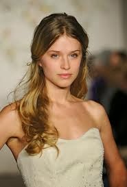 Hair and make-up is going to be an important factor within our music video. We wanted to link to John Newman's retro style, so have decided to opt for a vintage look rather than a modern take. Therefore, we have decided that the, 'half up-half down' style will work really well for the female actors; it will ensure that we can see their faces, yet it will add to the concept of movement within our piece too, which perhaps a more controlled hair do would not allow. We wanted again, to relate to the dance/party vibe within our music, therefore, the actors will wear bold eye-liner and red lipstick to represent getting dressed up for a night out or a party. We thought that foundation/colour of skin wouldn't be of quite as much importance, as soon they would be covered in paint!
Saturday, 12 October 2013
Powder Paint Fight: Costume Research
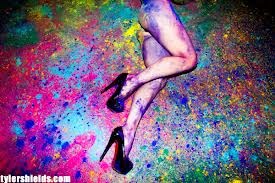
Initially, we thought that a 60's style fashion would look great as it would highlight the movement through all of the statement dresses. However, we then realised that this would not work so well with the modern, stylistic setup we are creating for the second scene.
We then became inspired by Tyler Shields' photography work, 'Chromatic'. His models wore white and black outfits which made the colours stand out very well.
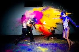 From here, we made the decision that the girls will wear white, sleeveless skater dresses and black high heels, whilst the boys will wear dark trousers and a smart white shirt. We chose these outfits as they are a mixture of smart and casual, so can be dressed up/down as appropriate. Therefore, this holds connotations with partying.clubbing, which is where our song would be most likely to be heard; we are making small links for the audience to match the visuals to the music.
Thursday, 10 October 2013
Powder Paint Fight: Prop Research
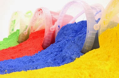 The most prominent prop we will be using is the powder paint. This is a chalk-like substance which creates some great effects when used in a variety of ways.
 We had to be aware of the quantity we would need, as we want to avoid re-shooting down to a lack of supplies, and we also wanted to get as much footage as possible.
Another consideration was the cost side of things. We didn't have a huge budget so wanted to get the best value product.
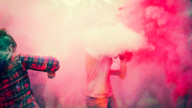 Lastly, we thought about which colours we wanted to use. We decided to go for bright, vibrant colours as these would provide a greater contrast against the darker setting. We have chosen pink. blue, green, orange, red and yellow and have ordered 2.5kg of each which we think will be enough to last us for this shoot, and hopefully some left over too.
Saturday, 28 September 2013
Island Records
Island Records are a huge institution who manage a number of very successful music artists. The label was founded by Chris Blackwell and Graeme Goodall in Jamaica in 1959. It then came to be based in the UK and is owned by the Universal Music Group, however they are based in many other countries, including America and Australia.
John Newman was signed at teh age of 20, amongst other artists including:
John Newman was signed at teh age of 20, amongst other artists including:
- Jessie J
- Dizzee Rascal
- Disclosure
- Bombay Bicycle Club
- Drake
- Avicii
- Ben Howard
- Dappy
- Mumford and Sons
- Nicki Minaj
- The Wanted

It is clear to see that they support a wide range of genres, from Ben Howard's indie style to Dappy's hip hop/rap clique. They have grown to be one of the leading record companies across the globe and are well recognised by both musical talents and the public alike.
Director Case Study: Shane Drake
Shane Drake is an American Director who's experience involves directing over 50 music videos as well as co-producing three films. Early in his career, Drake spent time working as an editor and cinematographer with such bands as Poison the Well, Deftones, Thursday and many more. He now spends most of his time directing and is the owner of red Van Pictures, a Los Angeles-based production company.
Drake has directed videos spanning the genres of Pop, Rock, Rap and Country, He has worked on music videos for artists including Timbaland, Paramore, Kelly Clarkson, Avril Lavigne, Fall Out Boy, Flo Rida, Will I Am, Tim McGraw, Taylor Swift, Keith Urban, Daughtry and many more.
As well as working with multi-platinum artists, Shane has also helped shape some of the original visual styles for new bands that have also gone on to see great success, the most notable of these acts being Panic! At The Disco. Since the band’s inception, Shane’s work with them has earned several VMA nominations and won “Video Of the Year” at the 2006 MTV VMA’s for the video “I Write Sins Not Tragedies”.
His style wavers more towards indie/rock/pop combinations which are genres where his most iconic music videos can be found. Here are some more examples:
Drake has directed videos spanning the genres of Pop, Rock, Rap and Country, He has worked on music videos for artists including Timbaland, Paramore, Kelly Clarkson, Avril Lavigne, Fall Out Boy, Flo Rida, Will I Am, Tim McGraw, Taylor Swift, Keith Urban, Daughtry and many more.
As well as working with multi-platinum artists, Shane has also helped shape some of the original visual styles for new bands that have also gone on to see great success, the most notable of these acts being Panic! At The Disco. Since the band’s inception, Shane’s work with them has earned several VMA nominations and won “Video Of the Year” at the 2006 MTV VMA’s for the video “I Write Sins Not Tragedies”.
His style wavers more towards indie/rock/pop combinations which are genres where his most iconic music videos can be found. Here are some more examples:
Thursday, 19 September 2013
Director Case Study: Director X
Director X is a Canadian director who has been working in the music video industry for over 15 years. His career as a director began with him directing the music video 'Richter Scale' by EPMD. He has worked with some huge names in the music industry including:
- Drake
- R. Kelly
- The Wanted
- Justin Bieber
- Nicki Minaj
- Sean Kingston
- David Guetta
- Ludacris
- Rihanna
- Usher
- Jay-Z
- Alicia Keys
- Little Mix
Here are some examples of his work:
Friday, 13 September 2013
Director Case Study: Emil Nava
Emil Nava is a British director who works with lots of well known artists including:
- Jessie J
- Rita Ora
- Paloma Faith
- Ed Sheeran
- Katy B
- Calvin Harris & Ellie Goulding
He is in the UK urban pop industry for music video directing. Since making it into the industry, he has also come to direct adverts too, such as the L'Oreal adverts with Cheryl Cole promoting for the company, and the vitamin water advert featuring Jessie J. He has had a great success with Jessie J; her video for Price Tag received over 180 million views on YouTube and was the #1 viewed video in the UK. Emil Nava also won best video for Jessie J 'Do It Like A Dude' at the 2011 Q Awards. When asked why he loves making music videos as opposed to feature films currently, he said:
"I think it’s just having such an open playing field to work with. When Ed Sheeran comes along with a song simply about love, it’s such a wide canvas try and make your video. So you really get to express really strong narrative on some, conceptual ideas on others or simply just a really strong, cinematic look. You get to express many different areas of your creativity and get to show it off a lot"His music videos are mostly narrative based and they have an edgy, fast cutting style which grabs audience attention. Although he enerally sticks to the genre of pop, this can be at any end of the scale; from Ellie Goulding's raw, edgy sound to Tinchy Stryder's street rap style, so he has to adapt the conventions of these sub-enres.
In my opinion, they are all quite predictable videos in that they are what you expect to see when you hear the song, which obviously shows he is meeting the genre conventions successfully.
Here are some examples of videos he has directed:
Friday, 6 September 2013
Textual Analysis of Little Things - One Direction
'Little Things' by One Direction is a mellow, romantic ballad which reached number 2 in the charts, after falling behind Gangnam Style. Originally written by Ed Sheeran, it is an cross between pop and indie, holding conventional features of both:
- There is a high performance element
- Lots of close ups of artists
- Repetitive guitar riff
- Puts you in a good mood
- Steady tempo
The music video is shot entirely in black and white, which gives the video a raw, simplistic vibe. It focuses is shot in a recording studio and shows the boys in an extremely stripped back light. It includes many close up shots shots of them looking directly into the camera, so as to appeal to their audience - as if they are singing it directly to the person watching. It also shows some wide/mid shots of them messing around with each other and being 'normal' - again so as to widen their appeal, for they are just like the, 'boys next door'. It has a real personal touch and you feel like you get to know each band member better as the video goes on. This combination of shots keeps the viewer captivated by the boys and thus makes them want to watch more and/or buy the song. It works well because existing fans see the boys as they know them and can recognise their personalities, and new fans get a glimpse of the boy's characters and can make a decision based upon this.
As a heavily performance based video, the lyrics relate to the visuals in the fact that they are being sung. However there are some smaller references to the lyrics within the visuals too, for example, with the lyric, "You can't go to bed without a cup of tea"- there are several mugs of (what I'm assuming is tea!) placed around the studio. Another reference is made to the first line, "your hand fits in mine like it's made just for me" during the opening shots, where there are a range of shots focusing on the boys' hands, itching their face, pushing a slider on the music deck, plucking the guitar strings etc.
The song as a whole relates to the visuals, as the concept of noticing the little things about someone is the simple thought behind it, and the fact that it is all shot in black and white adds to this rather minimalistic representation of the band members. Another major reference is made to guitars, with all of the boys having shots of them playing/holding a guitar at some point. This matches the main guitar riff/chords that are consistent throughout the whole song, and further emphasises the acoustic, natural tone of the video.
The song as a whole relates to the visuals, as the concept of noticing the little things about someone is the simple thought behind it, and the fact that it is all shot in black and white adds to this rather minimalistic representation of the band members. Another major reference is made to guitars, with all of the boys having shots of them playing/holding a guitar at some point. This matches the main guitar riff/chords that are consistent throughout the whole song, and further emphasises the acoustic, natural tone of the video.
Arguably the most powerful and significant entity within the music video is the star image motifs used. The band are represented as being normal teenage boys, and perfect boyfriend material for the intended audience. Each have their own individual style/look outside of the music world, but this is transferred through the costuming etc so they appear to be in their natural environment. It is arguable that this sense of normality is what is convincing for the audience, as it actually seems like a possibility to marry one of them as opposed to the likes of Robbie Williams or Justin Timberlake who sometimes appear unreachable/fantasy. This particular video is very different from their other music videos purely due to it's relaxed, mellow tone; usually One Direction create energetic, pop tracks such as, 'What Makes You Beautiful', 'Live While We're Young' or , 'Kiss You', so it is refreshing to see a nonchalant side to the band.
There is absolutely no reference to the notion of looking, in fact it is quite the opposite! You get the impression from the video that these are the kind of boys that would look after and appreciate you rather than use you for pure sexual attraction of any kind.
The music video is largely performance based, however there are some narrative elements within the lyrics, but they are not transferred directly into the visuals.
The music video is largely performance based, however there are some narrative elements within the lyrics, but they are not transferred directly into the visuals.
Overall, I absolutely love this music video. I think it suits the song and the band perfectly - it is something I could put on repeat, watch all day and never get tired of.
Wednesday, 17 July 2013
Time Lapse
I have always been intrigued by time lapse footage, whereby a camera is positioned in the same place for a certain duration of time, filming all that is in front of it. When sped up, some amazing effects are created and it is an extremely effective way to shrink time.
Below are some of my favourite examples of some beautiful time lapse content:
The City Limits from Dominic on Vimeo.
Another one of my favourites, despite it's stark contrast to the previous example is 'The City Limits'. I love the business of this video, and in terms of editing how the pace of the footage matches that of the song. The lighting is impeccable and really adds to the whole effect of the video - I thought the roads look like lava. I love the contrast the director provides us at the end when the song slows by showing less busy and more, I guess static shots which really help you process and think about the meaning; I think the director is trying to say, don't lose yourself in/limit yourself to the city - always go back to nature and reflect when possible.
Midnight Sun | Iceland from SCIENTIFANTASTIC on Vimeo.
This video truly captures the beauty of Iceland, and has made me really want to visit the all of the stunning locations within the country. Again the colour contrasts work fantastically and smooth shots make time seem to disappear.
Below are some of my favourite examples of some beautiful time lapse content:
I think that this is my absolute all-time favourite time lapse video. The settings are stunning and remind me of the true power of nature. The editing is perfect and the use of colour within each frame even further exaggerates the beauty within nature. The shots are so smooth and easy to watch, that it is almost convincing that this is the actual pace of the world; it looks so real!
Another one of my favourites, despite it's stark contrast to the previous example is 'The City Limits'. I love the business of this video, and in terms of editing how the pace of the footage matches that of the song. The lighting is impeccable and really adds to the whole effect of the video - I thought the roads look like lava. I love the contrast the director provides us at the end when the song slows by showing less busy and more, I guess static shots which really help you process and think about the meaning; I think the director is trying to say, don't lose yourself in/limit yourself to the city - always go back to nature and reflect when possible.
This video truly captures the beauty of Iceland, and has made me really want to visit the all of the stunning locations within the country. Again the colour contrasts work fantastically and smooth shots make time seem to disappear.
Thursday, 11 July 2013
Textual Analysis of Everything's Changed - Taylor Swift & Ed Sheeran
'Everything has changed' is a mellow country/pop/indie combination from a collaboration of Taylor Swift and Ed Sheeran. The concept surrounds two young children who represent their older, singing counterparts (Ed and Taylor) and follows the development of their friendship.
There is a strong connection between the lyrics, music and the visuals in the fact that the narrative closely follows the concept of friendship and getting to know someone better. For example, the boy and girl are at the beginning of their friendship, and they are both starting a new day at school - there is lots of reference to new beginnings. Following this, there is a direct link to the boy's appearance; when Taylor sings, "And all I've seen since 18 hours ago is green eyes and freckles and your smile in the back of my mind making me feel like" whereby there is a side-on mid-shot of the young boy drinking from a flask, highlighting his freckles and green eyes, followed by a shot of the young girl smiling. From this, we can assume that the girl in character is singing or thinking about the boy, so the concept of love is also active.
This kind of link is made throughout the whole video, as we come to learn more about the characters, which follows the theme of the lyrics, "I just want to know you better". We come to gather that they are both typical to their gender stereotypes; the girl is very neat, tidy and precise whereas the boy is more abstract and wild. For example, whilst decorating cookies in their class, the girl arranges a very sophisticated and neat double layered biscuit, whilst the boy is showing just piling everything and anything on his. This could have subtle references to the kind of people they are now, which they are trying to put across in the video to show their personalities. In terms of their current star images, lots of very subtle references are made, for example, when the girl is pretending to give the boy a tattoo, the boy drawing in orange in his book (one of Ed Sheeran's trademarks - ginger hair/orange in general) and when they are both doing yoga instead of running aroud like the other children. I think the idea was to set them apart from the others to show that they have always been different, and that that's not necessarily a bad thing.
There is a very slight reference made to the notion of looking, but it is more an admiration/awe rather than sexual desire - when the boy is painting the girl whilst she dances. Little occurances like this are made throughout, again when the boy is reading to the girl and she is looking up at him, and again when he plays the guitar for her.
We do not see any shots of Ed Sheeran and Taylor Swift until the end of the video where it is revealed that they are actually each child's parent. This is a twist to the audience, as prior to this it is hinted that the duo are playing the young Ed Sheeran and Taylor Swift, but we discover that they are actually their children, and prehaps their relationship could mirror their parents one - they could bring them together. It leaves on a real cliffhanger, as it seems like the children have such a lovely relationship that perhaps their parents would get on really well too.
Overall, I really love how the concept and narrative work so well together in this video, and the cating was perfect - the roles of the children were really convincing and it suited the song and genre perfectly.
Subscribe to:
Posts (Atom)